Game Developer Deep Dives are an ongoing series with the goal of shedding light on specific design, art, or technical features within a video game in order to show how seemingly simple, fundamental design decisions aren’t really that simple at all.
Earlier installments cover topics such as the starkly stylish art direction of Bloodless, how GOG updated Alpha Protocol for modern digital release, and how Ishtar Games approached the design of a new dwarf race in The Last Spell.
In this edition, Paradox Development Studios Black designers Valeska Martins and Ellinor Zetterman tell us why the tutorial mode for Crusader Kings III was due for a refresh and how UX was central to their approach.
Hello, we are Valeska Martins and Ellinor Zetterman, UX design lead and UX designer for Crusader Kings III, from Paradox Development Studios Black in Stockholm, Sweden. As a discipline, UX ensures that we keep our players at the center of our processes and solutions. We are here to help the team design the whole player experience, which includes—but is not limited to—UIs. This means that we have to approach the game from a holistic perspective, including a wide range of different disciplines in our work.

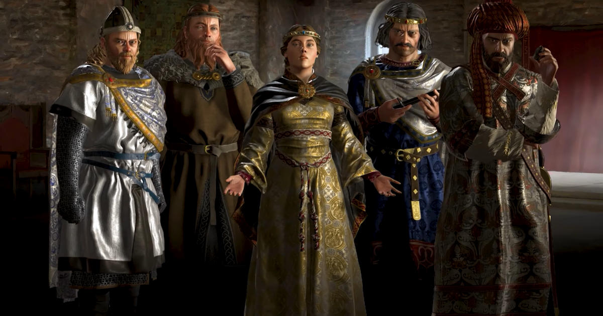
Image via Paradox Interactive.
Crusader Kings III is a grand strategy game set in the Middle Ages, released in September 2020 and developed by Paradox Development Studio. Unlike many grand strategy games, Crusader Kings III is character-driven, with most game interactions filtered through the lens of a specific character. The game is also succession-based; the character you play as will typically have an heir, who you will play as after your demise. It’s a grand strategy game in which you’re free to set your own goals, with a world seen through a dynastic lens as opposed to a national one.
By now, Crusader Kings III is approaching its fourth birthday, a fact plainly visible by the presence of all the additional content that’s been released since its launch. With this wealth of additional content adding complexity to the game, it’s important for us to ensure that our players can understand how to use the systems we introduce. This isn’t something we do by making our game mechanics simpler or easier, but by clearly communicating to the player how they can interact with various aspects of the game.
A whole lot of things can happen in Crusader Kings III. This is one of the strengths of the game, but it also creates a whole host of edge cases that can be tricky to deal with. There’s only so much control we can exert over the game once we set things in motion, and we want the introduction to the game to feel as genuine as possible, even if we’re easing the player into things. For instance, what happens if the player character dies of pneumonia while you were trying to teach them about how they can recover from illnesses?
Once we unpause the game, anything can happen. Because of this, it’d be impossible to try to map out a decision tree of carefully structured tutorial prompts. Instead, we have to approach the game as an open-ended sandbox. We can try to guide the players, but ultimately they’re the ones making the decisions, and we have to respect that. Besides, Crusader Kings III is at its best when unexpected things happen.
This article will dive deep into the recent changes to Crusader Kings III’s main tutorial. What motivated us to try it out, why now, and how did we do it?
Why make another tutorial?
As a studio, we always aim to make our players want to play and enjoy the game more, which is a metric we measure through the number of monthly active users our game has. While expanding and updating the game can help us achieve this goal, it has also led to us introducing a number of new mechanics that aren’t covered by the in-game tutorial. The telemetry data we gather shows that the tutorial has a significant impact on the retention rates of our players, despite the fact that it doesn’t cover all the mechanics you’ll need to know to succeed. All of this, coupled with a number of small pet peeves the UX department had with the tutorial as a whole, meant it was a good candidate for an experiment.
Instead of spending a large amount of time ideating and iterating on a perfect new tutorial, we thought a better approach would be to try an experiment in the form of a quicker, more concise tutorial. This way, we can gather data and feedback, which can help us better understand what kind of tutorialization works for our game. The hope is that this kind of initiative will help us understand how best to teach our players about new mechanics in upcoming releases. If the experiment turns out to be a success, that also means we’ve improved the gameplay experience for our new players, which is a nice added bonus.
While the idea had been brewing for some time, an initiative from our game director and the marketing department focused on new player acquisition: “Legends of Crusader Kings III“, seemed like an excellent opportunity to try it.
New player experience
Speaking of which, what is the new player experience in Crusader Kings III like? This is quite the multilayered question, seeing as players come into the game with a variety of experiences. Have they played Paradox games before? Are they completely new to grand strategy games? Generally speaking, it’s very easy to get overwhelmed when you start the game for the first time. This is something that we’ve been aware of for some time and also an aspect we thought we could at least attempt to mitigate through the introduction of a new tutorial.
A key principle that we can utilize here is the idea of progressive disclosure. This is a fairly straightforward concept in interaction design, which posits that one way to make users feel like a complex interaction is easy to interact with is by adding complexity bit by bit. Progressively, if you will. This is something we can introduce into a tutorial by, for instance, only showing parts of the interface when you’re first starting out.
The process
Starting out, it’s important to understand what it is we’re trying to solve. What are the tutorial’s core problems? Why are they problems to begin with? How have we, or other designers, tried to solve these problems in the past? These are the fundamental questions that we try to answer in this phase of the design process.
It’s important for us to not only tackle these questions through quantitative means, but also qualitatively. The data we gather through telemetry helps us understand where we should focus our efforts, but it’s not a crystal ball we can peer into to divine the perfect solution to any problem. In order to deliver a satisfying solution to a problem we discover, we need to consider not only our players but also the greater context in which the problem exists.
A key part of this is analyzing the strengths of tutorials in games in similar spaces to ours. A common theme we discovered in titles such as Civilization VI, and Against the Storm was the utilization of a narrative to frame the tutorialization. Another source of inspiration that helped us solidify the idea of progressive disclosure was the completely text-based game Silent Heaven. Because design is a highly iterative process, understanding what our peers do well is an important aspect of the problem-solving process.

Tutorials in other games. Image via Paradox Interactive.
After taking a look at some other games, it was time for some introspection. What does the current, longer tutorial do well? What does it do less well? One part of understanding this came from telemetry data, which we used to measure the impact of the tutorial on new players. Broadly speaking, we found that telemetry data indicated that finishing the tutorial wasn’t a major determining factor in whether or not a player decided to keep playing. While this doesn’t tell us the whole story, it does indicate that something about the tutorial was lacking.
A particularly intimidating aspect of the tutorial, especially from the perspective of a new player, is its length and information density. It takes a long time to complete, and it presents the player with a lot of information, not all of which is immediately useful. All the tutorial textboxes featured in the full tutorial can be seen in the image below. In total, the full tutorial presents the player with 67 sequential boxes full of explanatory information.

Comparison between old (left) and new (right) tutorial steps. Image via Paradox Interactive.
Not only does this take a long time to process and understand, but much of it is also superfluous since many of our players turn to video tutorials or other online resources to better understand the game once they’ve started playing. This led us to look for a way to craft an introductory experience that respects their time while still introducing them to the complex mechanics that we know our players love.
Once we had a burgeoning understanding of the problem we were trying to solve, it was time to start exploring possible solutions. This started with a few initial whiteboard sessions with relevant stakeholders from various disciplines, allowing us to explore a variety of ideas and possible flows that a new tutorial could follow. Something that was agreed upon fairly quickly was that the new tutorial should be faster to complete than the old one.
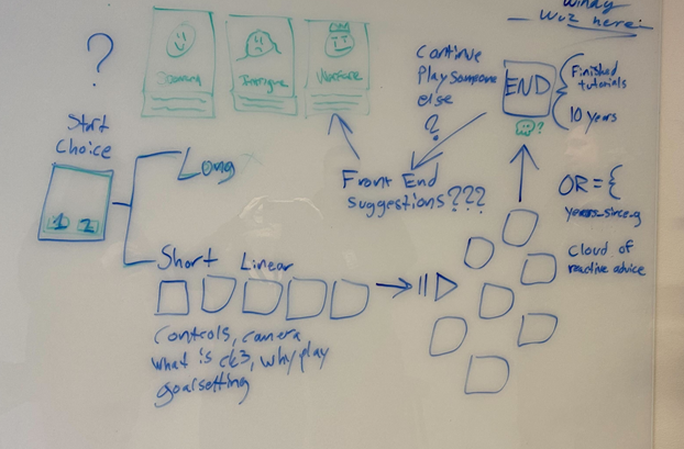
Whiteboarding Session. Image via Paradox Interactive.
To figure out what the new, shorter tutorial should contain, we turned to the preexisting one. We wanted to extract all the important parts of it and compress them into something more digestible. The first step of this was to figure out what didn’t feel strictly necessary to communicate to the player right away, and remove it. After doing this, we were left with roughly one-third of the 67 messages mentioned prior. These needed rewriting and reformatting to be properly implemented into the game, but they served as a baseline that we could continue to build upon.
While it would have been beneficial to explore other options, there simply wasn’t enough time for it. Because of this, we decided to evaluate the proposed flow to get some sense of whether or not it was something that was worth moving forward with. We met with other disciplines to gather initial feedback, leading to further iteration and changes to the tutorial flow itself. Code-wise, this meant cutting the parts of the proposed tutorial that would be a lot of effort to implement without providing much in terms of actual player value, while QA and game design provided us with insights into what we should focus on communicating to the player.


Tutorial Flow. Image via Paradox Interactive.
The time constraints meant we had to carefully consider what kind of prototyping approach to utilize for the project. Ultimately, we settled on using the game itself as the prototyping toolbox. This approach has two primary pros, namely that it minimizes the time it takes to move from prototype to implementation, and that it closely mimics the actual gameplay experience we’re trying to achieve. Fortunately, this also served as a good opportunity to iron out a few UI bugs that had been bothering us for some time.
One of these bugs was the fact that the GUI windows we use to display tutorial text didn’t dynamically adjust its size. While this was a fairly minor bug, it made the tutorial experience feel unnecessarily cluttered and complex, even when the actual text content was short.
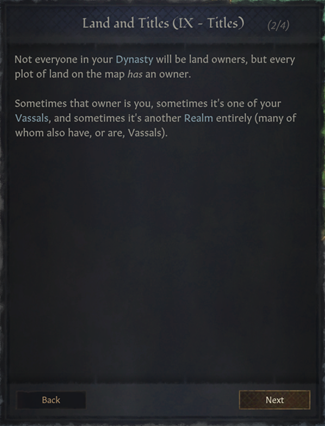
Improperly sized tutorial window. Image via Paradox Interactive.
One important aspect that we focused on was the concept of progressive disclosure—that is, as mentioned before, revealing information gradually to help players better understand the concepts we wanted to cover. One example of this is how we decided to gradually reveal information in the character panel.
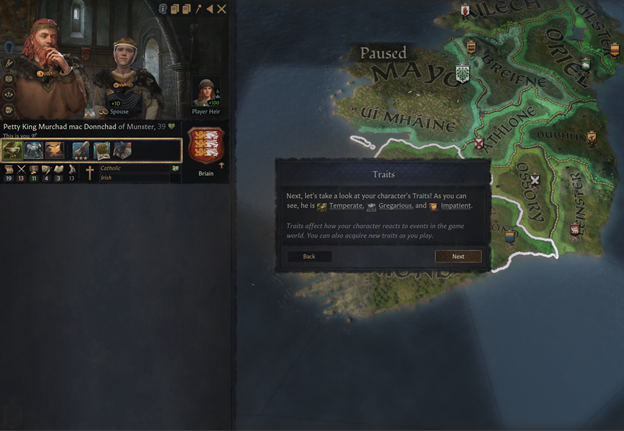
Revealing information gradually. Image via Paradox Interactive.
After the linear part of the tutorial was done, we shifted our focus to a softer onboarding experience for newer players. We focused on creating a handful of events that serve as a form of narrative hook for the player while also gradually introducing them to game mechanics which they’ll frequently have to interact with.
These events illustrate to the player that there are several ways to play and interact with the game and encourage roleplaying by highlighting that certain options are only available because of specific traits tied to the character you’re playing. Since events are a core part of the game, we felt it was important to tutorialize them in some way, which led to us adding explanatory text within the tooltips, something we don’t typically do for regular events.

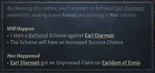

Above, a sample tutorial event. Images via Paradox Interactive.
Both of these sections, the linear tutorial and the events onboarding the players, were playtested internally. While we follow heuristics and guidelines when designing, these aren’t a substitute for proper user testing. The Crusader Kings III development team is a group of lovely, passionate people but we all collectively suffer from the curse of knowledge, meaning our perspective on the game isn’t necessarily reflective of our playerbase. Therefore, we made sure to try the tutorial on people who primarily work on other games in the office. This led to another round of changes, which ended up becoming the final iteration of the tutorial, which you can play right now!
Final words
As this was an experiment, we’re keeping the old, longer tutorial in the game as well so we can see how the two compare through telemetry. While we hope this new tutorial affects retention positively, there’s a silver lining even if it doesn’t. Knowing what doesn’t work can be valuable, and regardless of what the data tells us, it’ll help us make informed decisions in our future onboarding efforts.
I think the primary takeaway we have from this experiment is that you shouldn’t be afraid to try things. No result is a bad result as long as you’re willing to learn from it. Playtesting is incredibly valuable for this, but we primarily use it to gather qualitative feedback, meaning it’s difficult to find quantitative data we can act on without releasing something publicly. So, go out there! Break stuff! Iterate! Make stuff that’s better than what came before it!

