Game Developer Deep Dives are an ongoing series with the goal of shedding light on specific design, art, or technical features within a video game in order to show how seemingly simple, fundamental design decisions aren’t really that simple at all.
Earlier installments cover topics such as implementing crossplay functionality in We Were Here Forever, how Strange Scaffold created seamless dialogue for narrative poker game Sunshine Shuffle, and optimizing a fully spray-painted world in Bombing!! 2: A Graffiti Paradise.
In this edition, Sifu art director, Paul-Emile Boucher sheds light on the perspective that went into developing the game’s art direction.
This brilliant idea about a game lands on the table. Among pirates, Lovecraftian sci-fi monsters, medieval adventures, gloomy post-apocalyptic worlds, and all the other available themes out there, you have chosen your one and only, your precious! And then, you find yourself in front of a thousand different ways of executing your idea, seemingly piled up in a big stack of miscellaneous pieces of information, ambient inspiration, and endless references. How do you set the limits for your world-building to be coherent and enticing? Hopefully, our experience with Sifu can provide some interesting insights.
Straight from scratch, Sifu was destined to be a game about kung fu, an experience based on the ancient Chinese philosophy that promotes mastery through practice, an adventure that feels both cinematic and authentic. That’s precise enough, isn’t it? To a certain degree, yes. The clear early vision paved the way for the world-building approach and kept us gravitating toward a distinct creative direction.
On the other hand, on a topic such as kung fu, we could still swim in the ocean of subjectively selected references; The Disciples of Shaolin, Ip Man, and The Grandmaster are just a handful of titles on our otherwise long and arduous film list. And here’s where the rub lies, to avoid ending up with a patchwork of inconsistent ideas and truisms.
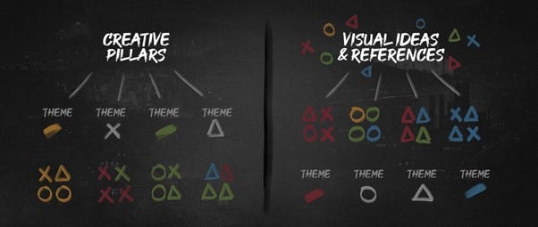
For us, the solution was found in mixing two approaches and concocting our custom-made framework. Either by setting out from the creative pillars and research to come up with visual ideas or the other way around, by kicking off from the references and shaping them into themes, we worked out a plan that fit our needs.
Laying down the groundwork
For a game like ours, set in a fictional Chinese city and hinged on an ancient martial philosophy, cultural accuracy, and authenticity were of utmost importance to the team. As an indie studio in Paris, we ensured this goal was met by enlisting expert help and consultants from the project’s early production stages.
Among others, we worked with a master who studied and lived for multiple years in Foshan, China and is one of the heirs of the Pak Mei Kung Fu School. We also ran numerous content reviews with Chinese consultants, applying their feedback on aspects like displayed text and details of the environment’s design.
More precisely, after immersing ourselves in the art of Pak Mei through a workshop in France, one thing that struck us was the deep bond between the disciples and their Sifu. From this experience, the sense of lineage and transmission emerged as the main topics upon which we built our narrative.
Following the same trail, we came across two salient concepts of Chinese philosophy: Wuxing and Confucianism. The first directly translates into five elements—wood, fire, water, Earth, and metal—encompassing the universe’s ongoing existence and development phases. These transitional forces are inherent in Chinese beliefs and deeply anchored in the martial arts mentality. Among others, wood is linked to flexibility, fire to explosiveness and speed, Earth to weight and power, metal to focus and hardening, and water to fluidity and absorption.
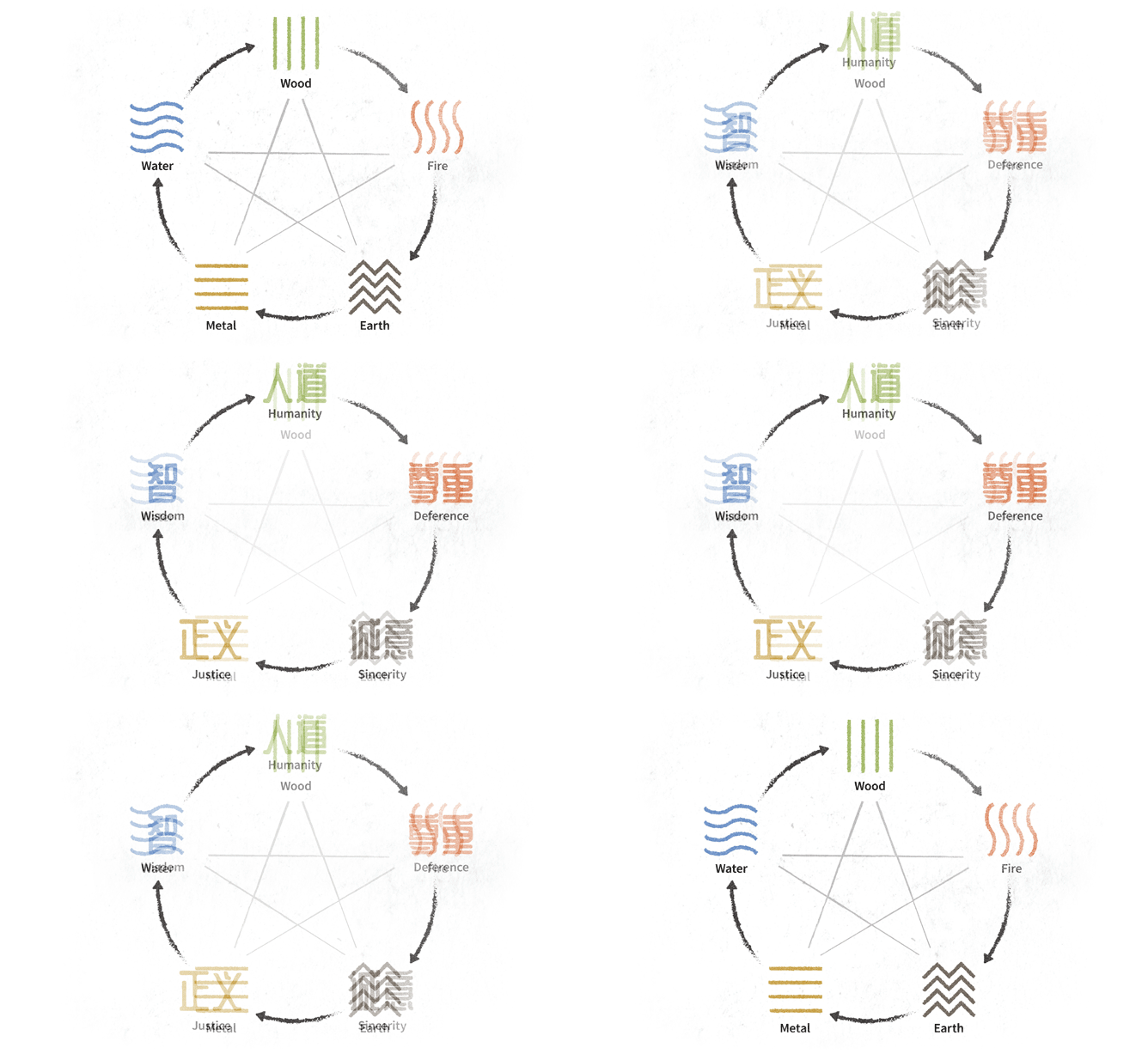
As far as Confucianism goes, there exist, again, five constant virtues comprising a moral code that serves as the foundation of harmony with enduring influence on Chinese society: Humanity, Deference, Sincerity, Justice, and Wisdom.
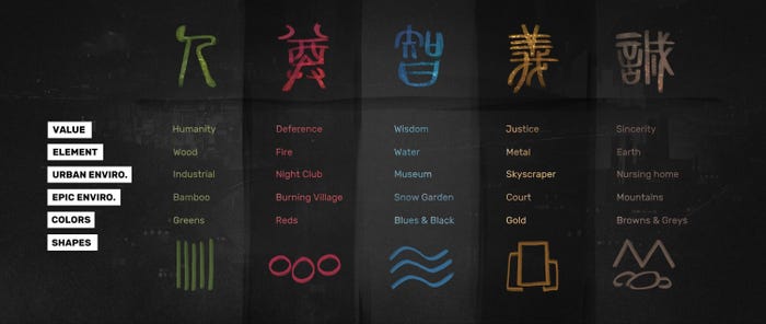
Pairing each of the five elements with a value, we came up with essentially a framework for our world.
Fleshing out the universe
As you may have already noticed, five was utterly turned into a magic number within the universe: five hideouts to visit, five talismans to get, five values to learn, five bosses to defeat… you get the drill.
Regarding the levels’ structure, we needed the player’s visual experience to intensify as they approached each boss. Each hideout had to depict a journey from credible urban environments to an epic, mystical version of the world. Thematically, each boss would represent the opposite of a given Confucian value, like a mirror turned upside down.
A secondary decision influencing the city’s structure was that the path should start humble and lead all the way up to the top social strata.
Let’s take a closer look at the framework’s application and how it helped us establish a chart for colors and shapes and set a mood.
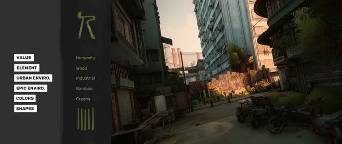

For the very first level, The Squats, the urban environment is an industrial area surrounded by a poor residential neighborhood heavily inspired by the district of Kowloon in Hong Kong. The Wuxing element of wood dictated the epic version of it, and we decided to go for a bamboo forest.
The obvious color choice was green, paired with vertical graphic patterns we could play with, from dirty money piles to the bamboo scaffolding. The whole architecture was designed to reinforce this verticality: pillars, antennas, pipes, fences, chimneys, and of course, the ever-invading moss and wild plants.
With these themes crystallizing, certain cinema references became an obvious choice for the first hideout. The Old Boy corridor sequence stood out with all the pipes and green hues, and The Raid with its tramp-resembling Prakoso character that fights with a machete.
For Fajar, the botanist, we picked Humanity as his opposite value. He was conceived as a solitary, feral character who is violent and mute. He moves like a wild beast, filled in with colors and accessories linked to wood.
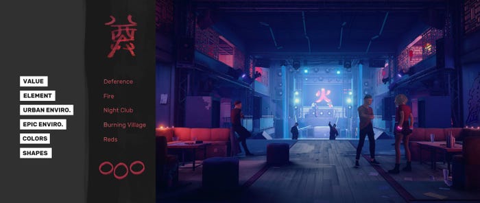

Moving to the second level, we transition from a nightclub to a burning traditional village. Red is the color of dominance that slowly takes over the space underpinned by the round shapes of Chinese lanterns.
This time, the rhythm of the mystical shift alters. Where, in the Squats, it was progressive and smooth, in The Club, it became aggressive, with sudden light switches and red and blue interchanges.
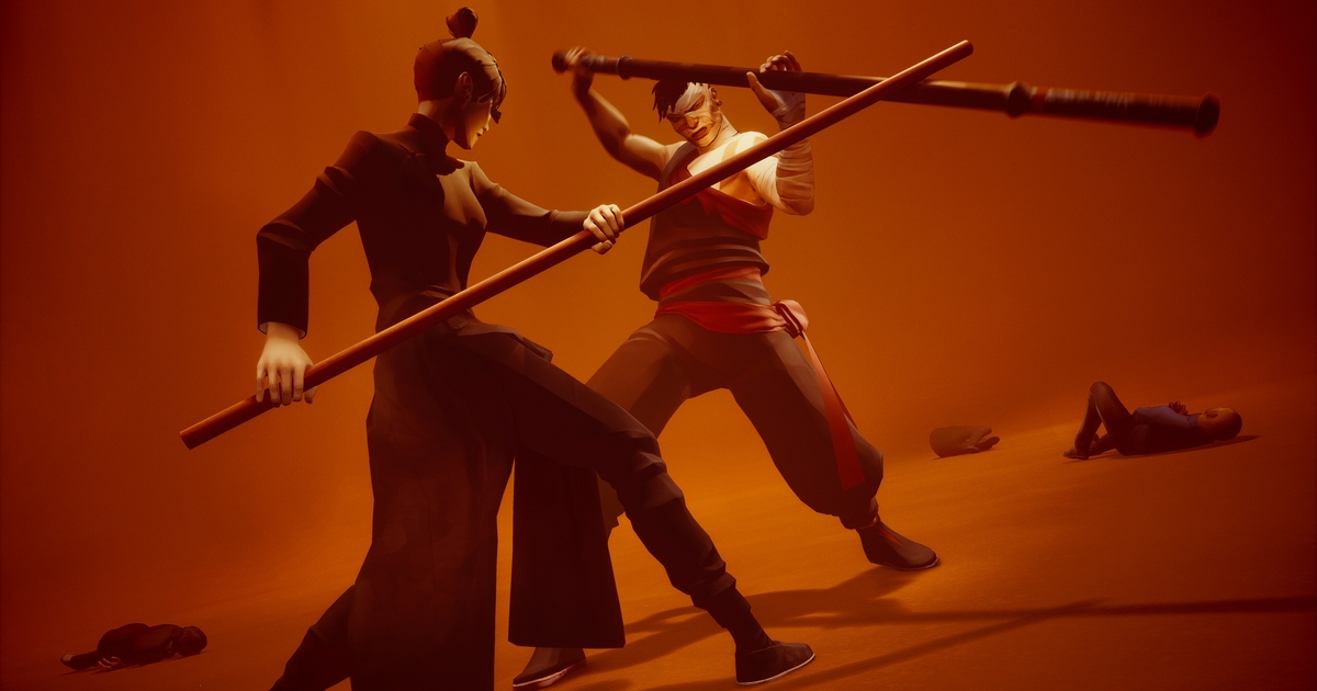
The Confucian theme here is Deference. Sean, the boss, was conceived as a former student who turned his back on the values and principles of kung fu by heading up an amoral fighting school and worshiping pain and pure physical strength. For this reason, his moves were inspired by Baji Quan, a very explosive Chinese fighting style, and the first visual references were traditional kung fu costumes mixed with MMA outfits to cover the illegal, underground fighting vibe.
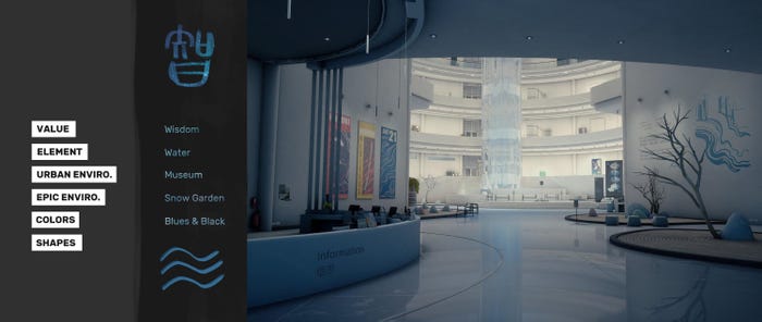

For The Museum, we wanted to illustrate a Gallery of Modern Art that feels fluid and credible. The Guggenheim Museum in New York and the Bourse de Commerce in Paris were our primary sources of inspiration for the architecture of the Atrium.
Traditionally, water is often associated with black in China, so the predominant colors are blue and black. The curves and waves accentuate the sense of a flowing structure, and we also decided to construct the building around an ascending waterfall.
That felt like the perfect opportunity to pay tribute to the opening scene of the movie The Grandmaster, and one of the art installations was designed as a direct nod to this scene.
The boss of the museum was also strongly inspired by a movie character. From Lady Snowblood, Yuki is the famous Japanese femme fatale who greatly influenced Lucy Liu’s character in Kill Bill and Kuroki.
The Artist is inversely associated with the value of Wisdom. Mourning the loss of her twin sister, and struggling with an overwhelming mix of ongoing feelings of grief, despair, guilt, anger, blame and loss, the Artist is revealed in a dichotomy of character. This juxtaposition is reflected through shifts between different states of water; the first is solid as the snow, while the next is black and liquid.
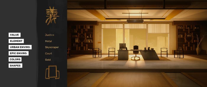

Forging ahead to the next hideout, we went for a skyscraper to portray a large financial corporation’s headquarters, which evolved as an assassin’s lair.
Gold limns monolithic and heavy rectangles and is set to the forth through metal structures and bouncing lighting. The elevator shaft provided, by design, the perfect backdrop for this particular Wuxing transition.
Progressively, the visual elements become distorted, enlarged, and amplified to accompany the player’s experience. The last mine becomes the inverted mirror of the lift leading to a vertical abyss, and the tiny lions perching on Jinfeng’s desk metamorphose into giant glowing yellow statues in the boss room.
As seemed fit, the value of Justice was associated with our CEO boss. Our references here vary, drawn by women in power, enlightened CEOs, and billionaire philanthropists. What’s more interesting is the film trope we tapped into when fleshing out Jinfeng, that of the one-armed warrior demonstrating the severity and austerity of a judge symbolized by her golden meteor hammer.
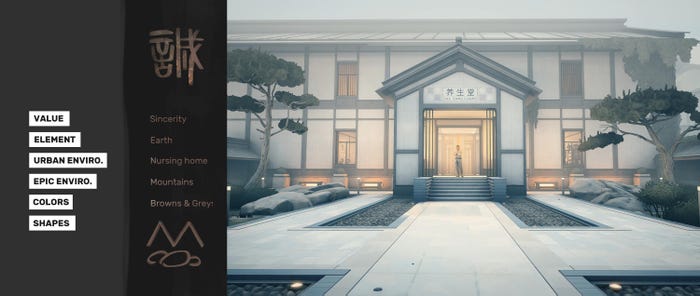

Finally, for the fifth hideout, we twisted our world-building rules to fit the story. Even after collecting all the talismans and their associated Wuxing elements, our last boss, Yang, has failed to achieve martial morality (Wude). As our game hinges on the spiral of revenge, we wanted the player to start feeling guilty for their actions by having them attack a serene and balanced environment. This is why we decided on a simple nursing home.
Here, everything mingles and collides. Brown and gray tints accompany slopes and pebbles as shapes. The natural light is desaturated and gray to contrast with the warm, practical lighting of the building and its brown hues.
While the sanctuary is primarily connected to Earth, with the mountains and stone gardens, the rest of the elements also make a strong appearance in the environment; burning lanterns, water, plants, and metal architectural structures.
As for Yang, he was associated with the opposite of the value of sincerity, appearing immaculate and pristine. He closely resembles our main character, featured as his alter ego and inspired by all the great martial art movie heroes. Dressed in white, he has the same fighting style as the player (Pak Mei from Foshan) and puts everything under a new perspective.
Lessons learned
As with any existing framework, ours came with both advantages and disadvantages. On the one hand, if you are like us at Sloclap, you can get immense satisfaction from the simple act of organizing sources of inspiration. And we get you; that alone can be dope! More importantly, this structured approach kept us navigating toward our north star in a defined and clear way. It guided us in constructing a coherent and authentic world with a hopefully distinctive touch and memorable environments.
On the downside, it adds up to artistic constraints and technical challenges. At times, we felt like we were up against self-inflicted challenges. For instance, initially, Kuroki had three phases attached to the water element: solid, liquid, and aerial. Something similar was planned for Fajar as well, but while the idea fit well the world-building chart from an artistic perspective, it was impossible to finish in time.
Another illustration of this is that while the principle of environment progression and transformation stemmed from this “chart” (and let’s admit it, creatively sounded like a good idea), it was also hard to pull off at 60 fps on PlayStation 4.
As with any game production, our experience was far from smooth sailing. At times, it felt like walking on hot coals, and at others, like pure bliss. What we definitely retain from this wild ride, and potentially the most crucial takeaway to figuring out yours, is that it needs to be tailor-made to your project’s needs. There’s no easy way around this, but at the end of the day, this is exactly what makes creative expression exciting.


